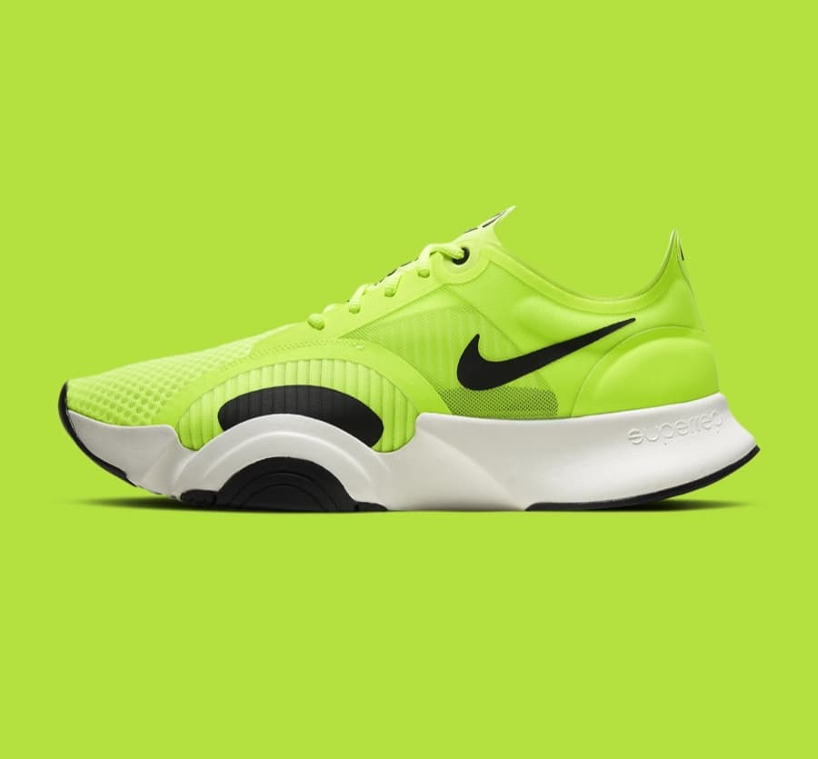
Branding is more than just a logo — it is a strategic tool that shapes how people perceive and interact with your business. Two of the most powerful yet often overlooked elements are colour and typography.
The psychology of colour in branding
Colour does three jobs at once. It stirs an emotion, it fixes your identity, and it sets you apart from the company next to you.
It is also the fastest thing you own. It lands before anyone reads a word, and it sets an expectation the rest of the brand then has to meet. Here is how the common choices tend to work.
- Blue — trust, stability, competence. The reason it dominates finance, healthcare and enterprise software, and also the reason it can read as safe to the point of forgettable.
- Red — urgency, appetite, energy. Powerful for a call to action and exhausting as a backdrop, which is why it usually works best as an accent.
- Green — growth, health, permission. The default for sustainability, wellbeing, and any interface where something has gone right.
- Black and deep neutrals — luxury, authority, restraint. Effective only when the product can support the claim; otherwise it reads as borrowed.
- Yellow and orange — optimism and approachability, bought at some cost to gravitas. Excellent for consumer warmth, harder in categories that trade on seriousness.
Did you know
Colour is processed before language is. A reader has taken in your palette and formed a first impression while their eye is still finding the first word.
Colour registers before a word is read. By the time someone reaches your copy, the palette has already made an argument on your behalf — or against you.
The role of fonts in brand perception
Type shapes how people read you, before they read you. A typeface can say professional and trustworthy. It can just as easily say playful, or expensive, or cheap.
Use the same type everywhere and recognition builds. Use a different one on every channel and it never starts.
Different styles pull different reactions. Serifs look classic and considered, so law firms and publishers lean on them. Sans-serifs read as modern and plain, which is why tech companies reach for them by default. Script and display faces add personality, and are the fastest way to look like nobody else.

Type is not only about looks. It decides whether people can read you at all. A bad choice makes text hard work, and hard work costs you credibility before your argument gets a hearing.
So the job is a balance. Pick something that says the right thing and stays legible on a phone, in an email, and at the bottom of a form.
Rule of thumb
Consistency outperforms cleverness
A merely adequate typeface used everywhere builds more recognition than an inspired one used in three places and abandoned in the fourth.
Colour and type are not decoration. They are the two fastest tools you have for shaping what someone thinks of you, and both do their work before a single sentence is read.
Choose them deliberately and you build trust and stand apart. Choose them by default and you inherit whatever meaning they already carried.